I have already demonstrated how I draw, ink and paint my work. The one part of the comic making process (atleast how I do it) is still unexplored, though: what I have at this point is a big pile of files scanned on my computer: line art, background paintings, character colour paintings, all this in a nice, jumbled mess.
What I do first is I vectorize all my black and white line art. There is no necessity to do this, but I do this to make it all nicely sharp, two -colour art. It's also easier to erase some made mistakes when they are vectors, and I also don't need to scan them with too big resolution.
 This I do with Adobe Illustrator. I have most of the Adobe -programs in full versions (yes, legally) since I have studied a profession that cursorily has need for them, so I bought them all with a nice, big "I'm still at school" -bonus back in the day.
Then I open my Photoshop. I do things by hand as much as I can, since a) I really like to do it and b) I hate when things look too Photoshopey. To me, it's fine to put them all together with this amazing program and put the finishing touches on them, since the basis is still done by hand.
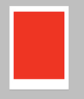
I have a model image file for the margins of the page, and I start with that. Then I start compiling the line art of every page on top of that.
As I have already explained, I make most every page in smaller pieces, usually two or three / page. I use the red colour in the model image to see that the images fit within the margins as I have hoped. I use the image composing option Multiply to see through the white bits. The end result looks something like this:
That's a rather easy page, though. Sometimes I think I'm clever and I make the individual pieces to go on top of each other. This means, that when I simply throw the vectorized art together, they obscure parts of each other. As you can see, one can't read the text and the characters show throw.
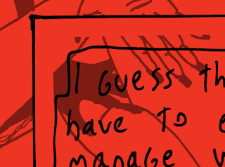 Then I just put a mask on the layers of the pieces and start painting out the unimportant bits. I play with the opacities to see what I'm doing.
When this is done, I simply fill the bottom layer, the model layer, with white.
After this the image should be done and the black and white line art be completely readable and fine. But now comes the stage when we put the colours in.
I start with the backgrounds. I find it easier for the brain to start from the "bottom" and build my way up. So I take my scanned background paintings, and put them on their place behind the line art layers, one by one.
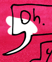 I use the little dots in the corners to see, where the background supposedly goes in comparison to the line art. And now we can already see what the images look like - there is just all this unimportant crap that we need to get rid of.
So I put masks on these layers as well, and start painting the needless stuff out. Like speech balloons - surely I want those to be white. Also I want the margins to be white. So those go out. I don't care about the characters yet, since they have their own separate layers up and coming.
In the end, the page looks like this:
Then come the characters. I put those layers on top of the background layers but still behind the line art, so they are still on top and you can see the character colours through them.
This obscures the background completely and looks like this:
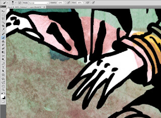 Notice how I have the corner markers here as well, so I can put the images where they need to go. Then I open the masks, and this time, since the characters are often smaller in the frames than the backgrounds, I paint the whole mask black and start painting the characters in again.
One of the reasons why I like to paint in the colour with water colours besides the texture is that it kinda forces me to approve some sloppyness when it comes to the colouring. I'm very meticulous when it comes to Photoshop -work and this paint stuff keeps me from going overboard.
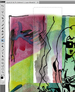 Then there are some more special things I sometimes do with the colours. Like this example has the smoke from Bianca's cigarette. I have painted it with gray, but I want the backgrounds to partially be visible through it. So I use the gradient tool in the mask to colour it so it kinda fades out the further it goes from the cigarette. Then I just paint out the stuff outside the lines and colour the surroundings normally.
The end result should already look pretty finished. We have characters, who appear to be in front of the backgrounds, white speech bubbles and everything else.
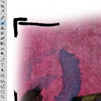 Now it's only some touch-and-go -stuff before I'm ready. For example, I sometimes leave lines in the line art that is there only to help me colour the stuff in Photoshop. Like in our example here, the first image is supposed to be borderless. So I take out the useless help borders I had inked into the image.
Another thing is, I'm not all that good at painting, especially mixing the colours. As I already said in the last article, I don't usually bother doing this but use predetermined shades to paint. This results in very bright, prime-colour scheme for the whole thing. And this is not necessarily the look I want.
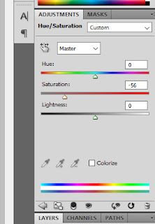
I wanted the surroundings of Bianca to feel kinda grey, nasty and dirty. So what I do is I put on an adjustment layer Saturation and tone all the colours down remarkably.
I put the layer either on top of everything or between the character colours and the backgrounds. My theory is, that if the scene takes place outside I tone everything down. You know that feeling you get from a cloudy day, when the light comes through the big shroud under the sky? That's what I'm going after here.
But, as is the case in our example, when the characters are inside I only desaturate the backgrounds. The reasoning is that the electrical lighting is more stark and bright and makes the people pop out from their backgrounds more.
So, here is the end result:
And this is how Bianca is made. I do try to put the utmost effort into this thing, which is why it sometimes takes uncomfortably long to crap this thing out. But I do my best, when life doesn't come in the way.




No comments:
Post a Comment